web
You’re offline. This is a read only version of the page.
close
Skip to main content

Announcements

News and Announcements icon
Community site session details

Community site session details

Session Id :
Power Platform Community / Forums / Power Apps / Create a chart column ...
Power Apps
Answered

Create a chart column in Power Apps to show report from multiple choose

(0) ShareShare
ReportReport
Posted on by 205
Hi Everyone,
 
I have a MS Form with multiple choice.
What color do you like?
Blue
Green
Red
Yellow
Pink
Purple
 
I have a flow to save MS Form responses to a SharePoint list (List A) with column name is Question.
Question
Blue, Red
Green, Red
Blue, Pink
Red, Purple
Green, Red, Pink

Can we create a chart column in Power Apps to show the report?
Like the image below.

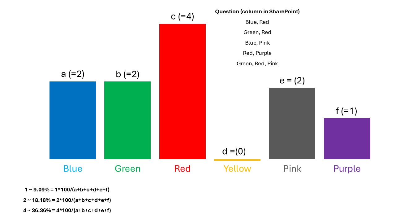
a,b,c,d,e,f are percentage number of times each value (Blue, Green, Red, Yellow, Pink, Purple) is selected.
This is the formula for calculating percentage: 1*100/(a+b+c+d+e+f)
 
Thank you for your helping.
Regards,
ROSE
Categories:
I have the same question (0)
  • Verified answer
    pavanmanideep Profile Picture
    574 Power Up Champ - 2025 on at
    Hi Rose,
     
    Are you allowed to use Power BI? It will be easy if that is the case.
     
    You can show as a chart in Power Apps..you need to split the Column A in sharepoint, group them and find the count...something like below....
     
    ClearCollect(ChartData,
        Ungroup(
            GroupBy(
                AddColumns(
                    Filter(ListA, !IsBlank(Question)),
                    "Colors", Split(Question, ", ")
                ),
                "Colors",
                "GroupedData"
            ),
            "GroupedData"
        )
    )


    Hope this helps you and gives you some direction.
     
    Thank you, please mark my answer as solution and give thumbs up if you found it useful.
     
    Regards,
    Pavan Mani Deep Y
    Biz Apps MVP
  • ROSEBLACK Profile Picture
    205 on at
    Thank you for your helping @pavanmanideep,
    I have tried your code but it's not working.
     "Colors" what does that mean?
     
    For Power BI, I'm using a free license (not PBI Pro), can I create a realtime live chart in My workplace? that mean if the SharePoint list is updated it also update the PBI report.
     
    Regards.
    ROSE
  • Suggested answer
    pavanmanideep Profile Picture
    574 Power Up Champ - 2025 on at
    Rose, Colors is a new column, storing the multiselect values from sharepoint
     
    ID Question Colors
    1 Blue, Red ["Blue", "Red"]
    2 Green, Red ["Green", "Red"]
    4 Blue, Pink ["Blue", "Pink"]
    5 Red, Purple ["Red", "Purple"]
    6 Green, Red, Pink ["Green", "Red", "Pink"]
     
    AddColumns(
        Filter(ListA, !IsBlank(Question)),
        "Colors", Split(Question, ", ")
    )
     
    Power BI Free doesn't allow to automatic refresh, you may need to refresh manually...it will be ok for POC purpose, but not in real sense.
     
    Thank you, please mark my answer as solution and give thumbs up if you found it useful.
     
    Hope this helps..
     
    Cheers,
    PMDY
  • ROSEBLACK Profile Picture
    205 on at
    Thank you @pavanmanideep
    I'm getting the error below when use your code.
     

Under review

Thank you for your reply! To ensure a great experience for everyone, your content is awaiting approval by our Community Managers. Please check back later.

Helpful resources

Quick Links

Introducing the 2026 Season 1 community Super Users

Congratulations to our 2026 Super Users!

Kudos to our 2025 Community Spotlight Honorees

Congratulations to our 2025 community superstars!

Congratulations to the March Top 10 Community Leaders!

These are the community rock stars!

Leaderboard > Power Apps

#1
11manish Profile Picture

11manish 536

#2
WarrenBelz Profile Picture

WarrenBelz 426 Most Valuable Professional

#3
Haque Profile Picture

Haque 305

Last 30 days Overall leaderboard